Trident
Logo of a different color…
Client Since 2007
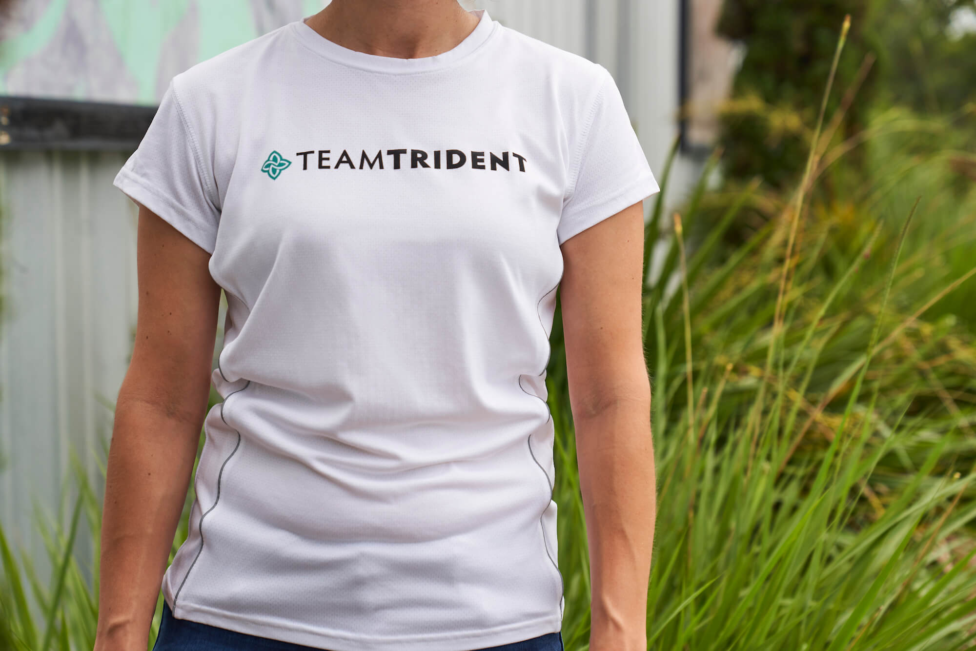
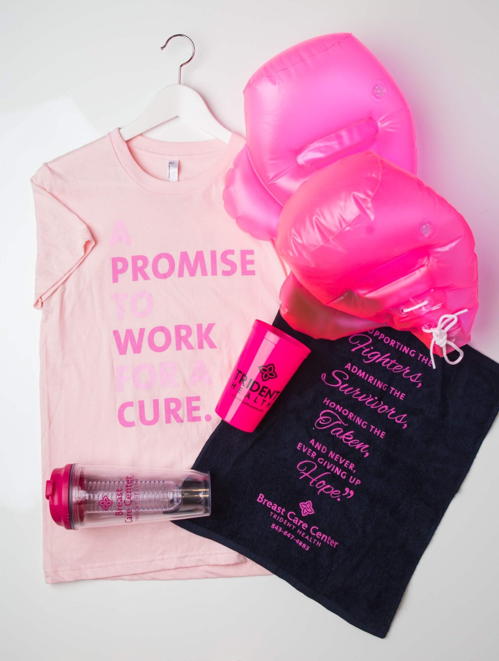
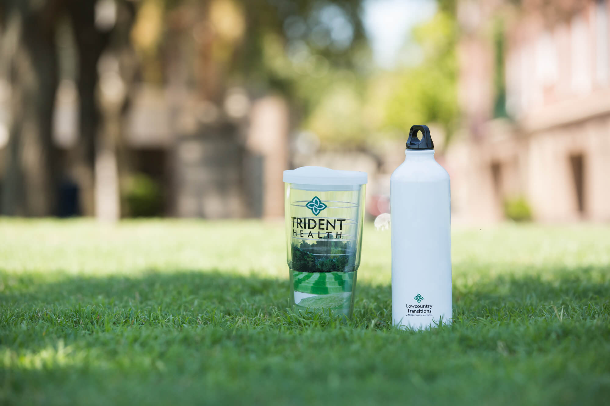
Trident (HCA Health) came to us needing a reliable source for promo in all types of department and marketing needs. Our team became the go-to for hundreds of departments’ employee apparel, medical apparel, event marketing items and signage, employee and patient gifts – and everything in-between. A huge pain point was their brand’s chartreuse color and the ever-unmatching product that they would receive.
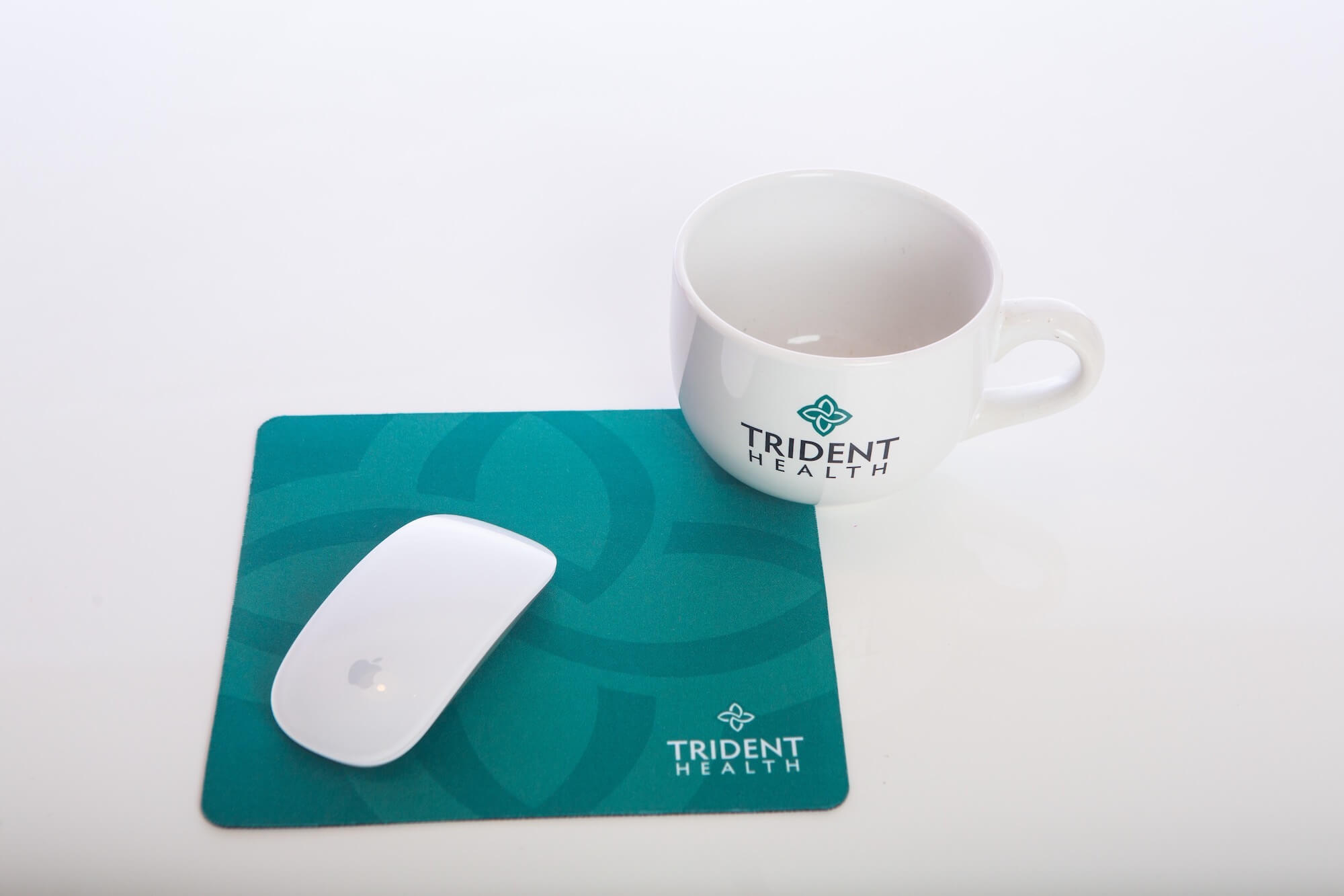
Our team, leading in design, is well-versed in color matching and print techniques. The marketing materials now flowing into Trident were on point with the brand’s colors, and all was well with the world. In 2011, Trident rebranded to a new Icon based logo with a new PMS color. While a bit easier to achieve and match across various items, it was still a unique teal requiring that same attention to color and detail as before. We assisted with the entire rebranding of 5 hospital locations, 45+ logo versions, and more than 600 individual items created to support the various departments and marketing team with new or reordered merch as needed for various programs and events.
Over the years, our play on using the new logo and the items chosen to reach& marketing goals have set us apart along with our customer service to ensure the various HR all is on time, well received, and of course, is PMS 562c.
